- Share
- Like
- Tweet
- Digg
- Tumblr
- VKontakte
- Love This
- Odnoklassniki
- Meneame
- Blogger
- Amazon
- Yahoo Mail
- Gmail
- AOL
- Newsvine
- HackerNews
- Evernote
- MySpace
- Mail.ru
- Viadeo
- Line
- Comments
- SMS
- Viber
- Telegram
- Subscribe
- Skype
- Facebook Messenger
- Kakao
- LiveJournal
- Yammer
- Edgar
- Fintel
- Instapaper
- Copy Link
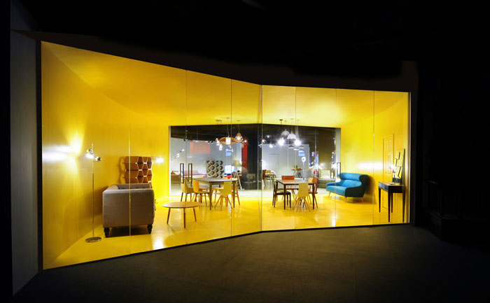
Architects Bureau de Change presents some of MADE’s most iconic pieces of furniture in a unique installation display in the new flagship store in Soho. The unique approach to using technology in the retail space guides customers through a completely different experience.
Credit @ Eliot Postma
From Architects Bureau de Change:
The brief for the award winning MADE.com store was to re-evaluate the concept of a ‘showroom’ and incorporate technology in a way that would genuinely add value to the customer experience.
Credit @ Eliot Postma
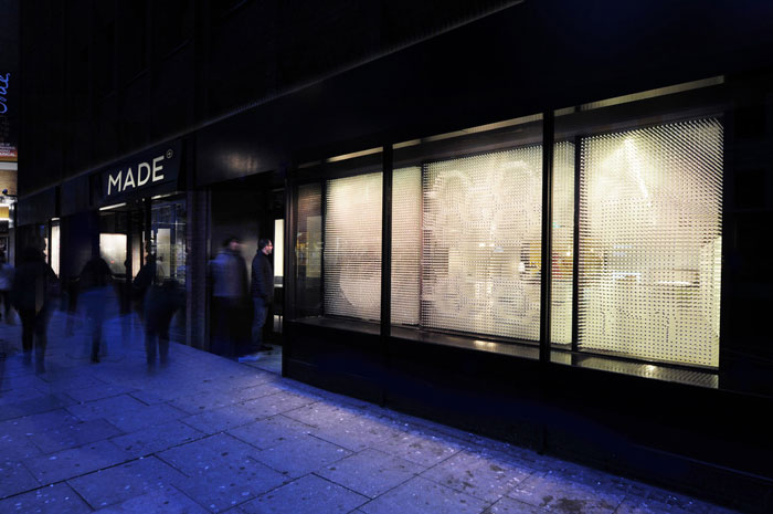
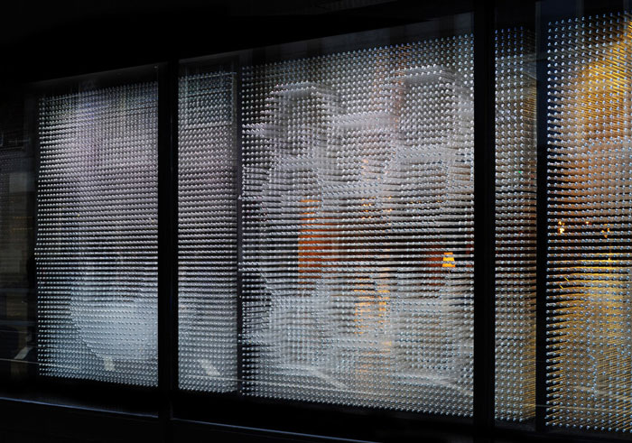
Located in one of Europe’s busiest shopping districts, the new store experience begins with the external windows. Rather than display product behind the glass, the glazing itself becomes a full scale representation of the product in an intricate temporary installation.
This is such a bustling street, with so many stores vying for your attention, we wanted to produce something unexpected – an idea that would set it apart from the traditional product display format. Instead, we have taken a single idea – of the products pushing through the glazing – and filled each window with it. You still get a sense of the products beyond the frontage, but the views are more intriguing, more oblique.
– Billy Mavropoulos, Bureau de Change co-founder
Credit @ Eliot Postma
Credit @ Eliot Postma
Almost 40,000 hollow clear plastic rods puncture the 10 windows of the store to create three-dimensional ‘pinpressions’ (similar to the 1980’s executive PinArt toy) of some of MADE’s most iconic pieces of furniture.
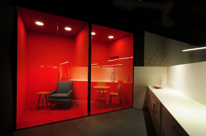
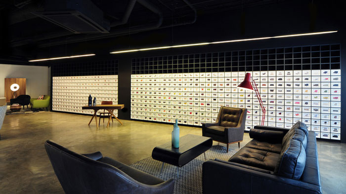
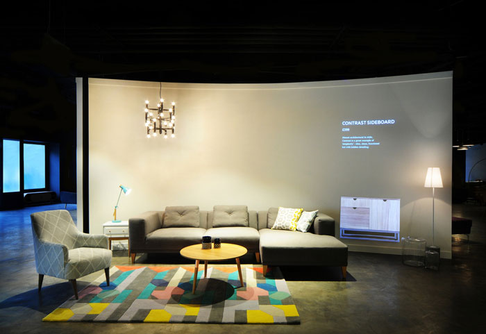
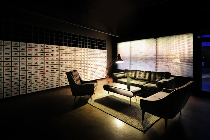
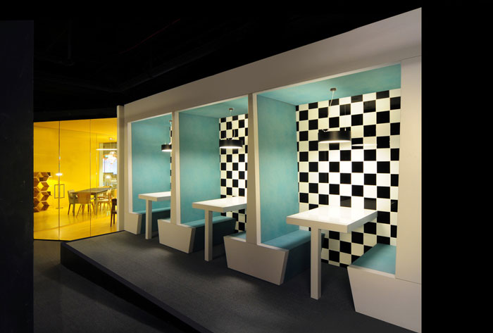
Inside, the store blends physical product with full scale projections in a series of room sets. Customers are guided through a network of white-washed walls – curved like the pages of a book (referencing the literary history of Charing Cross Road). These walls provide a clean backdrop for the furniture and a canvas upon which products can be projected. The use of large format projections mean a single room can show multiple combinations of product changeable on demand.
Credit @ Eliot Postma
Credit @ Eliot Postma
Credit @ Eliot Postma
This opens up the possibility for customers to experience the full product catalogue without requiring a hangar-like showroom or costly central storage facilities.
MADE has always been ahead of the curve, and so the Soho store had to offer something more than the typical high street experience. For us, the design challenge was how to display in-store, where space is at a premium, the breadth of content you can on a website. The projections provide a true, adaptable representation of the products, at the right scale, in the right place. Without them, the room sets feel unfinished, so for us they were the missing link to achieving a flexibility you can normally only achieve online.
– Katerina Dionysopoulou, co-founder of Bureau de Change
Customers are provided with tablets on which they can browse and find further product information about their favourite pieces.
Credit @ Eliot Postma
Alongside the digital experience, a large physical furniture sample archive provides an opportunity to touch and feel fabrics and explore colour swatches to help decision-making.
Taking on a central London location is a huge step for us as a brand. We see it as an opportunity to meet with a broader range of customers and for them to experience the MADE way of thinking. The space was designed on a tight budget and timeframe but Bureau de Change brought a lot of ingenuity and flair and turned an old rundown bookstore into a crisp, spacious and inviting design for our customers.
– Chloe Macintosh, MADE.COM Co-Founder and Creative Director
Bureau de Change won the award for best large retail space at the 2015 World Interior News Awards.
*All images and information courtesy of v2com.


