- Share
- Like
- Tweet
- Digg
- Tumblr
- VKontakte
- Love This
- Odnoklassniki
- Meneame
- Blogger
- Amazon
- Yahoo Mail
- Gmail
- AOL
- Newsvine
- HackerNews
- Evernote
- MySpace
- Mail.ru
- Viadeo
- Line
- Comments
- SMS
- Viber
- Telegram
- Subscribe
- Skype
- Facebook Messenger
- Kakao
- LiveJournal
- Yammer
- Edgar
- Fintel
- Instapaper
- Copy Link
Designed by id inc., the SUMIYOSHIDO kampo lounge brings back memories of old-fashioned Japanese pharmacies. Pale mint coloured cabinets are stacked along walls to create a space for healing but also one where customers can learn about oriental medicine. Open drawers are used to display herbal samples where visitors can get a feel for aroma and texture.
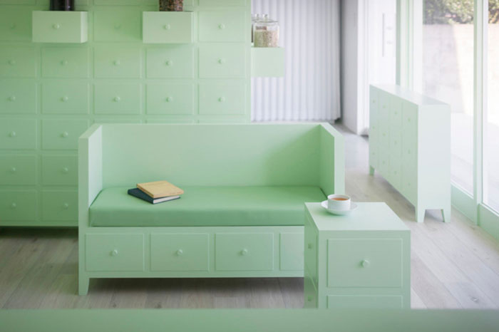
Image © id inc.
From id inc.:
Japanese design office id designed SUMIYOSHIDO kampo lounge, clinic for acupuncture and moxibustion. Kampo lounge is a new shape of herbal pharmacy where doctor prescribes based on oriental medicine and also those who are willing to take herbal medicine in their lifestyle are able to learn deeply about it. Moreover, clinic for acupuncture and moxibustion is a place where treatment based on oriental medicine is provided.
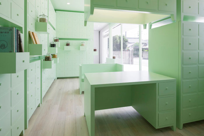
Image © id inc.
A space surrounded by many medicine shelves. Since early times, there have been many medicine shelves at pharmacies where handle herbal medicine. Though furniture with many drawers is supposed to be filled with medicine, I felt that it is also filled with history and deep knowledge of herbal medicine.
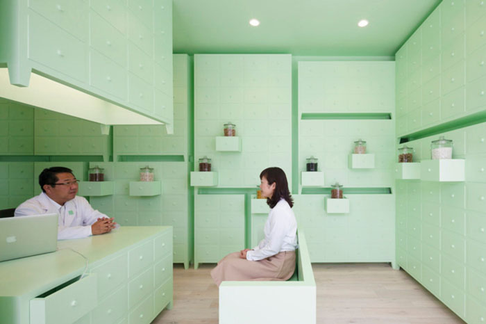
Image © id inc.
The medicine shelves are lined up and stacked up. Opened drawers are designed to display natural medicine samples and feel its aroma and texture. Furniture used for providing counseling sessions such as a light fixture, desk, and sofa, which constitutes its space, was also designed to have a uniform expression as medicine shelves. Many drawers represent how SUMIYOSHIDO faces to treatment with integrated methods.
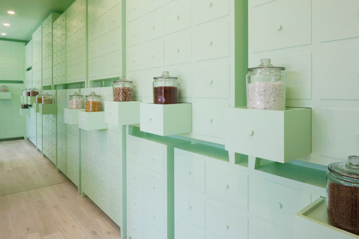
Image © id inc.
The space painted in mint green colour freshly expresses a world of herbal medicine which is derived from plants. The soft color is intended to create curiously ambivalent atmosphere that heaviness and lightness of furniture coexist.
In contrast, the clinic for acupuncture and moxibustion is a quiet space painted in uniformed white. Thick drape curtains were intended to create a soft impression even though it is an examination room.
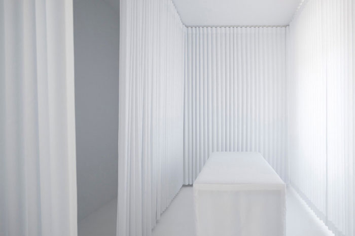
Image © id inc.
Taking advantage of its wide opening frame, the place was intended to be looked like a large show window. Kampo lounge in mint green and clinic for acupuncture and moxibustion in white is clearly separated by a waiting room. It expressly tells that one building has two spaces for each different purpose.
Japanese design office id also designed logos and graphic tools for lounge and clinic in accord with those interiors.
Facts:
Design: id inc.
Location: Handa, Aichi, Japan
*All images and information courtesy of v2com.


