On the occasion of the opening of their second shop, the client has mandate Parka’s team to design the interior of the boutiques and their new branding.
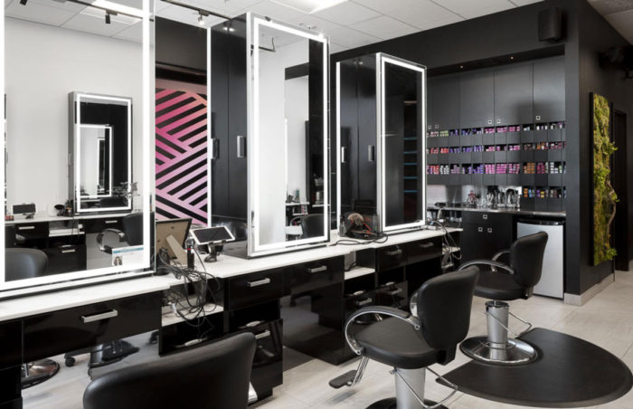
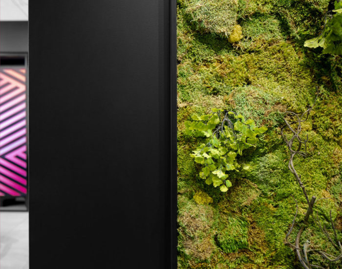
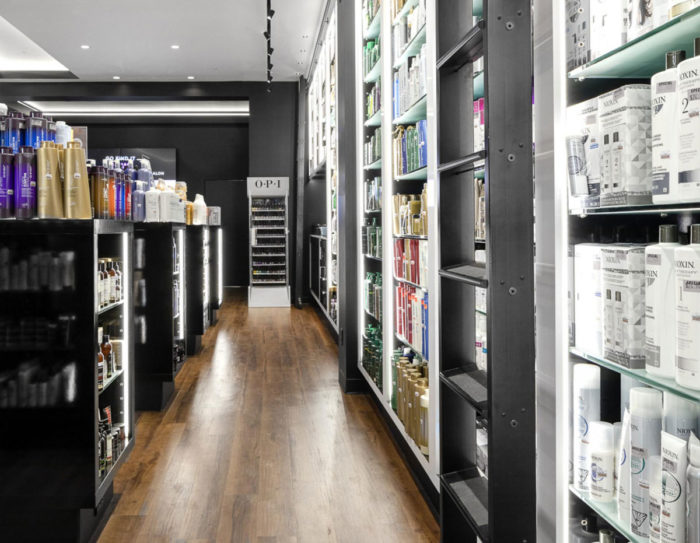
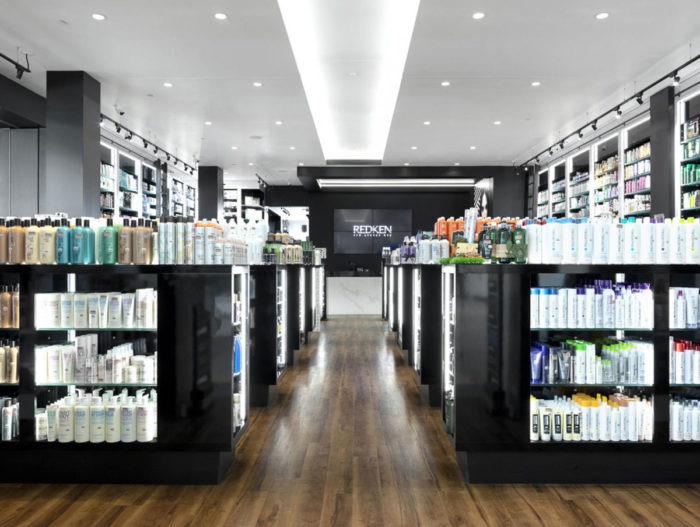
In order to highlight the hair product lines and to offer a unique experience to the customers, Parka has designed a concept where luxury and dynamism meet. By focusing on materials such as wood, granite and lustrous furniture, the large range of products takes place in an atmosphere that is both warm and chic.
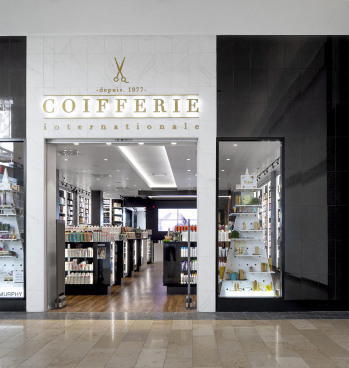
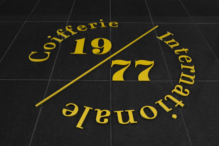
As for the visual identity, Parka chose a classic gold typography, reminiscent of the very first boutique, opened since 1977 at Place de la Cité mall.
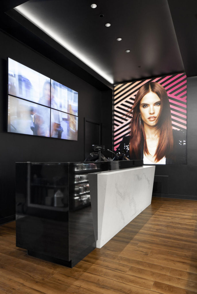
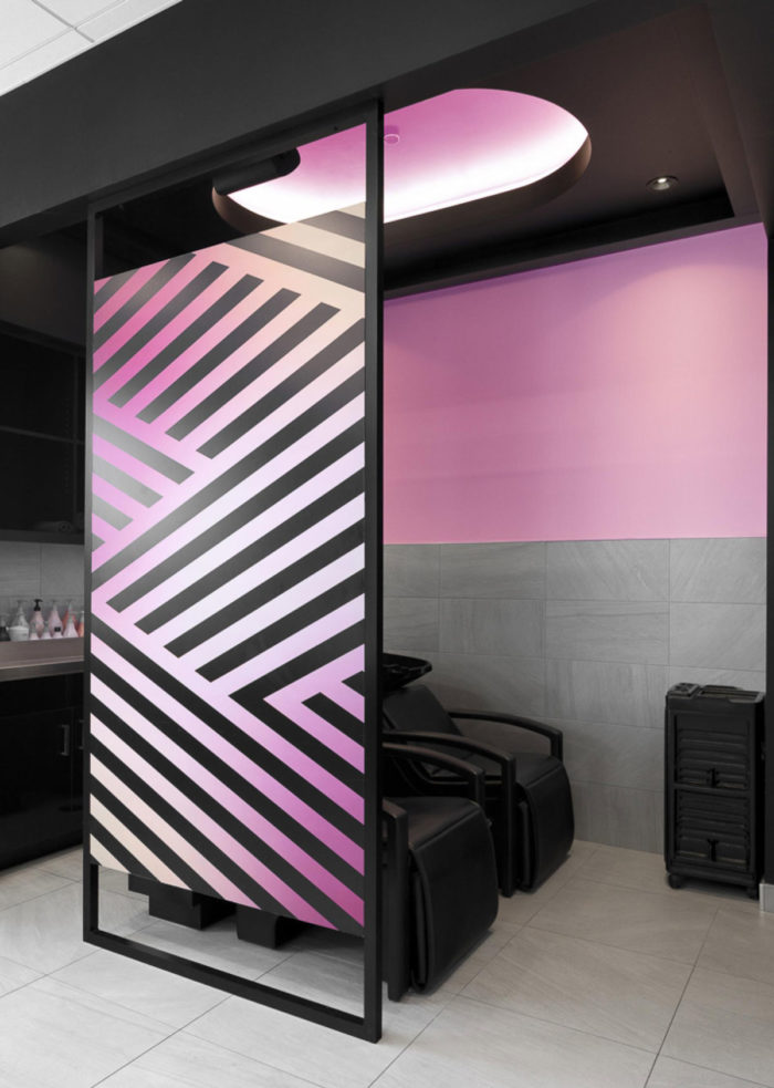
The pink and black crossed lines, like a braiding, are part of the graphic signature. Some graphic elements animate the experience through the different areas (consultation, reception, waiting and hairdressing).
In addition, a large screen, located on the main facade, presents an app to test different hairstyles. Ipads are also integrated into the interior design to offer a more personalized experience.
Image © Jessy Bernier Photographe Image © Jessy Bernier Photographe Image © Jessy Bernier Photographe Image © Jessy Bernier Photographe
Facts
Year: 2017
Client: Jimenez family
Architecture: Parka
Graphic Design: Parka
Interior design: Parka
Location: Galeries de la Capitale, Québec (Québec), Canada
Project type: Commercial
Size: 223 m²
Photo credit: Jessy Bernier Photographe

